 |
The Galaxy M31s is the latest in Samsung's line of all too similar phones. It is the upgraded version of the Galaxy M31, which is similar to the M21 and is an upgraded version of the M30s. All of these phones look very similar, have nearly identical specifications with a few bits swapped around, and have all been released in the span of a year.
So what's the situation with the Galaxy M31s? Well, it seems despite the overwhelming similarity on paper, the Galaxy M31s seems to have a different body this time around, even though it oddly doesn't look all that different at first glance. Yet, there are enough changes here that need to go through a fine-toothed comb. These changes do subtly change the way you use the phone, so they aren't insignificant.


Samsung Galaxy M31s: Design, Build, and Display
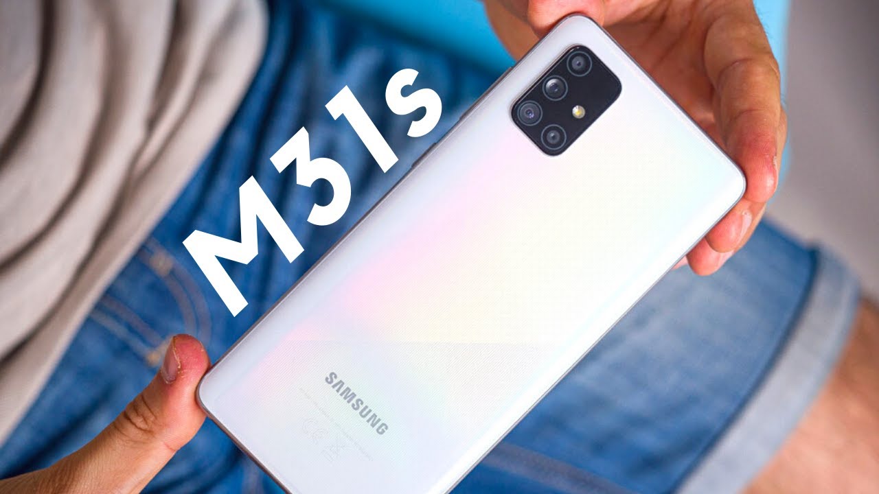
The Samsung Galaxy M31s marks a small upgrade in the design language that Samsung has employed in its M-series lineup so far. While the basic plastic look and feel of the device remain largely the same as its predecessors, the Galaxy M31s opts for a gradient coloring on the back which gives the device its own identity. The Mirage Black unit that we received starts off with a silver-chrome color towards the top and merges into a black color towards the bottom. The chrome color is a little difficult to capture on camera, and the gradient is a lot more gradual in the middle than what the device renders suggest. The back also has a glossy finish.

If you look closely, you’ll notice that the Samsung Galaxy M31s does not have a rear fingerprint sensor, as the sensor has been moved to the side which doubles as the power button. Samsung could have chosen to go with an in-display fingerprint sensor, but the speed and reliability are as good as a conventional rear fingerprint sensor, so I have no complaints. The placement is also good, though users with smaller hands might appreciate it being placed lower. All the buttons also click well.


![Samsung Galaxy Note 20 Ultra: 5 reasons to pick up this pricey powerhouse Android. [Video]](https://blogger.googleusercontent.com/img/b/R29vZ2xl/AVvXsEjdc40_y-k4JrummzdG9ITJGn_QU8YIBoqlwMtoC45dT5YiF8NtERwK6YJyuuxPxVeszj1-NIiManexIMQrK-o2KumpdBkNaj1crkLFVWHZk6rUGP0IMIHX-SRQrPmREaefIpZAhQZ_U6c/s72-c/ezgif.com-resize.gif)


No comments: